Carbon Footprint 1990-2008


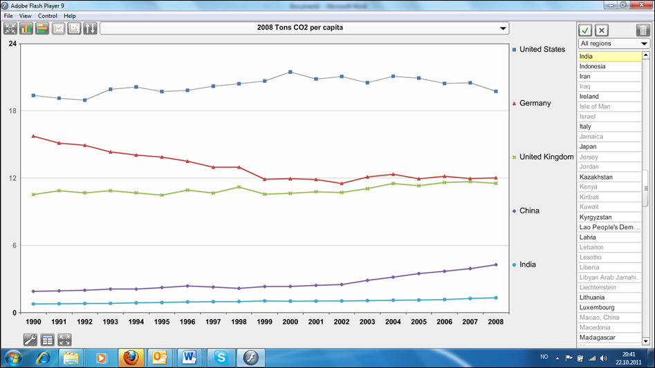
We present now a time series of carbon footprints in the Ranking tab. Our data lets you trace the development of carbon footprints over the period 1990-2008. You need an Adope Flash player installed to see this. This data represents national CO2 emissions corrected for trade and shows that some countries that have had reductions of national emissions have nonetheless increased their carbon footprint, like the UK. You just need to click on the country and you see the time series. You can click several countries after each other to produce a comparative chart. Unfortunately, for most countries, the trend is upward, but there are a number of European nations that have succeeded to stablize and even reduce their carbon footprints over this time period, especially Germany and formerly communist countries. One can only hope that more countries adopt the stringent policies that Germany has adopted and similarily become leaders in renewable energy and energy efficiency without compensating in some other dimension.
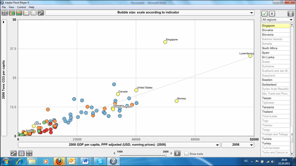
The StatPlanet tool we employ also lets you compare per capita emissions and per capita GDP (see figure), and to let this run as a film forward from 1990 to 2008. You can choose whether you prefer the real GDP in constant prices or the GDP corrected for purchasing power parity (PPP). Of course, I would also have liked to let you choose whether you want a linear axis or logarithmic. I personally favour logarithmic axes because this reflects better the real distribution and lets you see differences on the lower end. It also reflects the way economists calculate elasticities.
This wonderful time series is based on a set of extrapolations from the GTAP database in three years along with known macroeconomic data. It was produced by my former colleague Glen Peters in collaboration with Jan Minx, Christopher Weber and Ottmar Edenhofer and introduced in an earlier blog by Jan Minx. The work has been published in the prestigious Proceedings of the National Academy of Sciences.

